Trapezoid

사다리꼴

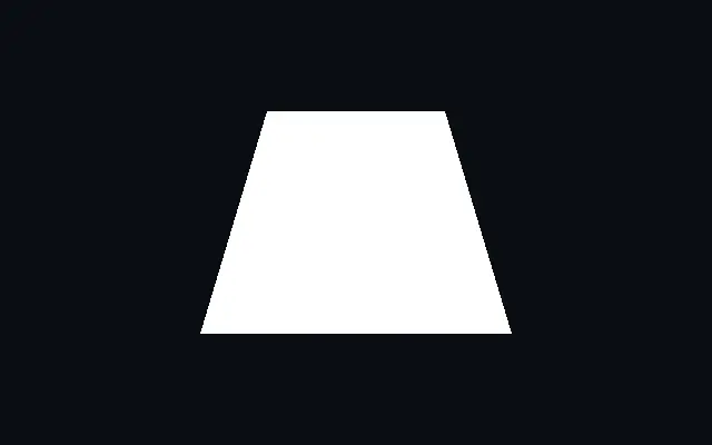
A trapezoid with independently adjustable top and bottom widths.

Also known as: TrapezoidTrapezium

Moves in browsers that support WebGPU

This device could not render the demo — showing a still

React
// Renders only in browsers with WebGPU.
import { Shader, Trapezoid } from 'shaders/react'

export default function ShaderEffect() {
  return (
    <Shader style={{ width: '100%', height: 320 }} disableTelemetry>
      <Trapezoid />
    </Shader>
  )
}
Vue
<!-- Renders only in browsers with WebGPU. -->
<script setup lang="ts">
import { Shader, Trapezoid } from 'shaders/vue'
</script>

<template>
  <Shader style="width: 100%; height: 320px" :disable-telemetry="true">
    <Trapezoid/>
  </Shader>
</template>
Svelte
<!-- Renders only in browsers with WebGPU. -->
<script>
  import { Shader, Trapezoid } from 'shaders/svelte'
</script>

<Shader style="width: 100%; height: 320px" disableTelemetry>
  <Trapezoid />
</Shader>
Solid
// Renders only in browsers with WebGPU.
import { Shader, Trapezoid } from 'shaders/solid'

export default function ShaderEffect() {
  return (
    <Shader style={{ width: '100%', height: '320px' }} disableTelemetry>
      <Trapezoid />
    </Shader>
  )
}
JavaScript
// Renders only in browsers with WebGPU.
// expects <canvas id="canvas" style="width:100%;height:320px"></canvas> on the page
import { createShader } from 'shaders/js'

const shader = await createShader(document.getElementById("canvas"), {
  components: [
    {
      type: 'Trapezoid',
    }
  ]
}, { disableTelemetry: true })

Props · Trapezoid

Changes apply to the demo above and to the code tabs. Descriptions come from the library registry (MIT).

NameValueDefaultRange / optionsDescription
originOriginSet in codecenter—Reference edge the center position is measured from (center default). Lets you pin the shape relative to a corner or the canvas centre.
colorColor#ffffff—Fill color of the trapezoid
centerCenter
x0.5y0.5
{"x":0.5,"y":0.5}x, y: 0 – 1Center position of the trapezoid
bottomWidthBottom Width0.350.01 – 1 (step 0.01)Half-width of the bottom edge
topWidthTop Width0.20.01 – 1 (step 0.01)Half-width of the top edge
heightHeight0.250.01 – 1 (step 0.01)Half-height of the trapezoid
rotationRotation00 – 360 (step 1)Rotation in degrees
softnessSoftness00 – 0.1 (step 0.001)Edge softness for antialiasing
strokeThicknessStroke Thickness00 – 0.2 (step 0.005)Stroke thickness. Zero means no stroke.
strokeColorStroke Color#000000—Color of the stroke outline
strokePositionStroke Positioncenteroutside · center · insidePosition of the stroke relative to the shape edge
colorSpaceColor Blendinglinearlinear · oklch · oklab · hsl · hsv · lchColor space for blending fill and stroke colors

Every component also takes blendMode · opacity · visible · maskSource/maskType · boundingBox · id

A trapezoid has top and bottom edges of different lengths. It can suggest a grounded base or a perspective panel while adding direction.

`topWidth` and `bottomWidth` set the half-widths of the top and bottom edges, each from 0.01 to 1. `height` is the half-height from 0.01 to 1, and `rotation` turns the shape from 0 to 360 degrees.

The top can also be wider than the bottom, so set the two widths deliberately when the direction matters. Place it beside `Parallelogram` to show the difference between slanted sides and unequal edge widths, and check the narrower side's spacing when placing text over it.

When to use

Use it for bases, banners, or perspective-like panels that need different top and bottom widths. It can also emphasize direction in a mark or diagram. Avoid it when you need parallel opposite sides or rounded corners.

Open as page ↗