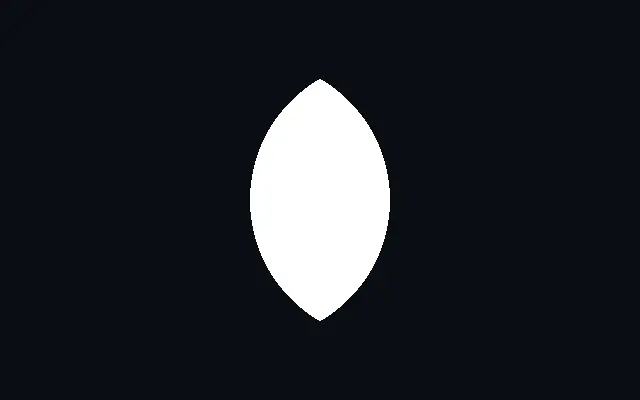
Crescent

초승달

A crescent silhouette formed by subtracting an offset inner circle from an outer circle.

Also known as: CrescentCrescent moon

Moves in browsers that support WebGPU

This device could not render the demo — showing a still

React
// Renders only in browsers with WebGPU.
import { Shader, Crescent } from 'shaders/react'

export default function ShaderEffect() {
  return (
    <Shader style={{ width: '100%', height: 320 }} disableTelemetry>
      <Crescent />
    </Shader>
  )
}
Vue
<!-- Renders only in browsers with WebGPU. -->
<script setup lang="ts">
import { Shader, Crescent } from 'shaders/vue'
</script>

<template>
  <Shader style="width: 100%; height: 320px" :disable-telemetry="true">
    <Crescent/>
  </Shader>
</template>
Svelte
<!-- Renders only in browsers with WebGPU. -->
<script>
  import { Shader, Crescent } from 'shaders/svelte'
</script>

<Shader style="width: 100%; height: 320px" disableTelemetry>
  <Crescent />
</Shader>
Solid
// Renders only in browsers with WebGPU.
import { Shader, Crescent } from 'shaders/solid'

export default function ShaderEffect() {
  return (
    <Shader style={{ width: '100%', height: '320px' }} disableTelemetry>
      <Crescent />
    </Shader>
  )
}
JavaScript
// Renders only in browsers with WebGPU.
// expects <canvas id="canvas" style="width:100%;height:320px"></canvas> on the page
import { createShader } from 'shaders/js'

const shader = await createShader(document.getElementById("canvas"), {
  components: [
    {
      type: 'Crescent',
    }
  ]
}, { disableTelemetry: true })

Props · Crescent

Changes apply to the demo above and to the code tabs. Descriptions come from the library registry (MIT).

NameValueDefaultRange / optionsDescription
originOriginSet in codecenter—Reference edge the center position is measured from (center default). Lets you pin the shape relative to a corner or the canvas centre.
colorColor#ffffff—Fill color of the crescent
centerCenter
x0.5y0.5
{"x":0.5,"y":0.5}x, y: 0 – 1Center position of the crescent
radiusSize0.30.05 – 1 (step 0.01)Outer circle radius
innerRatioBite Size0.80.3 – 1.2 (step 0.01)Inner (bite) circle radius as a fraction of outer radius
offsetBite Offset0.20.01 – 0.5 (step 0.01)Horizontal distance the bite circle is shifted from center
rotationRotation00 – 360 (step 1)Rotation in degrees
softnessSoftness00 – 0.1 (step 0.001)Edge softness for antialiasing
strokeThicknessStroke Thickness00 – 0.2 (step 0.005)Stroke thickness. Zero means no stroke.
strokeColorStroke Color#000000—Color of the stroke outline
strokePositionStroke Positioncenteroutside · center · insidePosition of the stroke relative to the shape edge
colorSpaceColor Blendinglinearlinear · oklch · oklab · hsl · hsv · lchColor space for blending fill and stroke colors

Every component also takes blendMode · opacity · visible · maskSource/maskType · boundingBox · id

A crescent looks as if another circle has bitten into one side of a round shape. Its moon-like silhouette is easy to recognize as an icon or directional accent.

`radius` sets the outer circle radius from 0.05 to 1. `innerRatio` is the inner circle radius as a fraction of the outer one, from 0.3 to 1.2. `offset` moves the inner circle horizontally from the center, from 0.01 to 0.5. Use `rotation` from 0 to 360 degrees to turn the crescent.

The combination of `innerRatio` and `offset` changes both the bite's width and position. Place it alongside `Circle` to compare the forms or add a `Star` as a backdrop accent, and check that its opening remains clear at small sizes.

When to use

Use it for moon icons, night themes, or directional decoration. Its bitten, asymmetric silhouette can guide attention. Avoid it when you need a closed circle or a symmetric circular band.


Open as page ↗