Flower

꽃 모양

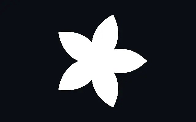
A radial flower shape with adjustable petal count and valley depth.

Also known as: FlowerPetal shapeRosette

Moves in browsers that support WebGPU

This device could not render the demo — showing a still

React
// Renders only in browsers with WebGPU.
import { Shader, Flower } from 'shaders/react'

export default function ShaderEffect() {
  return (
    <Shader style={{ width: '100%', height: 320 }} disableTelemetry>
      <Flower />
    </Shader>
  )
}
Vue
<!-- Renders only in browsers with WebGPU. -->
<script setup lang="ts">
import { Shader, Flower } from 'shaders/vue'
</script>

<template>
  <Shader style="width: 100%; height: 320px" :disable-telemetry="true">
    <Flower/>
  </Shader>
</template>
Svelte
<!-- Renders only in browsers with WebGPU. -->
<script>
  import { Shader, Flower } from 'shaders/svelte'
</script>

<Shader style="width: 100%; height: 320px" disableTelemetry>
  <Flower />
</Shader>
Solid
// Renders only in browsers with WebGPU.
import { Shader, Flower } from 'shaders/solid'

export default function ShaderEffect() {
  return (
    <Shader style={{ width: '100%', height: '320px' }} disableTelemetry>
      <Flower />
    </Shader>
  )
}
JavaScript
// Renders only in browsers with WebGPU.
// expects <canvas id="canvas" style="width:100%;height:320px"></canvas> on the page
import { createShader } from 'shaders/js'

const shader = await createShader(document.getElementById("canvas"), {
  components: [
    {
      type: 'Flower',
    }
  ]
}, { disableTelemetry: true })

Props · Flower

Changes apply to the demo above and to the code tabs. Descriptions come from the library registry (MIT).

NameValueDefaultRange / optionsDescription
originOriginSet in codecenter—Reference edge the center position is measured from (center default). Lets you pin the shape relative to a corner or the canvas centre.
colorColor#ffffff—Fill color of the flower
centerCenter
x0.5y0.5
{"x":0.5,"y":0.5}x, y: 0 – 1Center position of the flower
radiusRadius0.40 – 1 (step 0.01)Outer petal tip radius in UV space
sidesPetals53 – 12 (step 1)Number of petals
innerRatioInner Ratio0.40.1 – 0.95 (step 0.01)Inner valley radius as a ratio of outer radius — lower values make deeper notches
rotationRotation00 – 360 (step 1)Rotation in degrees
softnessSoftness00 – 0.1 (step 0.001)Edge softness for antialiasing
strokeThicknessStroke Thickness00 – 0.2 (step 0.005)Stroke thickness. Zero means no stroke.
strokeColorStroke Color#000000—Color of the stroke outline
strokePositionStroke Positioncenteroutside · center · insidePosition of the stroke relative to the shape edge
colorSpaceColor Blendinglinearlinear · oklch · oklab · hsl · hsv · lchColor space for blending fill and stroke colors

Every component also takes blendMode · opacity · visible · maskSource/maskType · boundingBox · id

The flower shape repeats rounded petals around a center. It adds a soft radial rhythm to a badge or decorative pattern.

`sides` sets the number of petals from 3 to 12. `radius` measures the distance to the outer petal tips from 0 to 1, and `innerRatio` sets the inner valley radius as a proportion from 0.1 to 0.95. A lower `innerRatio` makes deeper valleys, while `rotation` changes the orientation from 0 to 360 degrees.

Many petals and deep valleys can make the outline busy at small sizes. Pair it with `Star` to contrast pointed and rounded radial shapes, and lower its color contrast in a backdrop so it does not compete with the content.

When to use

Use it for petal badges, decorative patterns, or soft radial emphasis. It also works as a dot-like sticker or center-focused accent. Avoid it when its outline details collapse at the intended size.

Open as page ↗