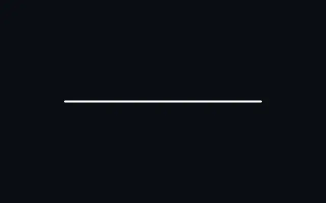
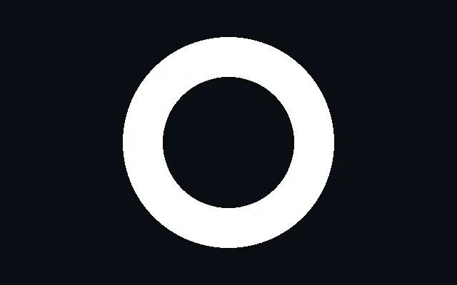
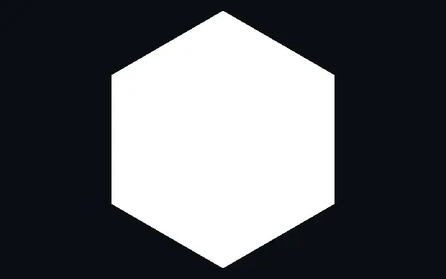
Connect two points with an adjustable-width solid, dashed, or dotted line.
Also known as: LineStraight lineLine segment
Moves in browsers that support WebGPU
This device could not render the demo — showing a still
Code reflects the control values
React
// Renders only in browsers with WebGPU.
import { Shader, Line } from 'shaders/react'

export default function ShaderEffect() {
  return (
    <Shader style={{ width: '100%', height: 320 }} disableTelemetry>
      <Line />
    </Shader>
  )
}
Vue
<!-- Renders only in browsers with WebGPU. -->
<script setup lang="ts">
import { Shader, Line } from 'shaders/vue'
</script>

<template>
  <Shader style="width: 100%; height: 320px" :disable-telemetry="true">
    <Line/>
  </Shader>
</template>
Svelte
<!-- Renders only in browsers with WebGPU. -->
<script>
  import { Shader, Line } from 'shaders/svelte'
</script>

<Shader style="width: 100%; height: 320px" disableTelemetry>
  <Line />
</Shader>
Solid
// Renders only in browsers with WebGPU.
import { Shader, Line } from 'shaders/solid'

export default function ShaderEffect() {
  return (
    <Shader style={{ width: '100%', height: '320px' }} disableTelemetry>
      <Line />
    </Shader>
  )
}
JavaScript
// Renders only in browsers with WebGPU.
// expects <canvas id="canvas" style="width:100%;height:320px"></canvas> on the page
import { createShader } from 'shaders/js'

const shader = await createShader(document.getElementById("canvas"), {
  components: [
    {
      type: 'Line',
    }
  ]
}, { disableTelemetry: true })
Props · Line
Changes apply to the demo above and to the code tabs. Descriptions come from the library registry (MIT).
Name
Value
Default
Range / options
Description
colorColor
#ffffff
—
The color of the line
pointAPoint A
xy
{"x":0.2,"y":0.5}
x, y: 0 – 1
The start point of the line
pointBPoint B
xy
{"x":0.8,"y":0.5}
x, y: 0 – 1
The end point of the line
thicknessThickness
0.01
0 – 0.25 (step 0.001)
The thickness of the line. A value of one (1) matches the canvas height.
styleStyle
solid
solid · dashed · dotted
The line style: solid, dashed, or dotted. Dashes and dots are spaced to land exactly on both endpoints.
dashLengthDash Length
0.05
0 – 0.5 (step 0.001)
The length of each dash, including its caps
gapLengthGap Length
0.025
0 – 0.5 (step 0.001)
The gap between dashes, or the spacing between dots
capStartStart Cap
rounded
square · rounded
Cap shape at the start of the line (point A). Rounded caps center on the endpoint; square caps end flat exactly at it. Also shapes the A-facing end of each dash and dot.
capEndEnd Cap
rounded
square · rounded
Cap shape at the end of the line (point B). Rounded caps center on the endpoint; square caps end flat exactly at it. Also shapes the B-facing end of each dash and dot.
Every component also takes blendMode · opacity · visible · maskSource/maskType · boundingBox · id
A line connects a chosen start and end point. It shows a relationship between two positions as a divider, connector, or route in a diagram.
`pointA` and `pointB` set the start and end. `thickness` controls width from 0 to 0.25, and `style` selects `solid`, `dashed`, or `dotted`. Use `gapLength` from 0 to 0.5 to adjust spacing between dashes or dots.
Dashes and dots are arranged to land on both endpoints, so changing their spacing does not leave an awkward partial mark at the ends. Pair the line with `Circle` or `Polygon` as a diagram connector, and check that overlaps do not hide the shapes' outlines.
When to use
Use it for diagram connectors, dividers, or progress paths. Solid, dashed, and dotted styles can distinguish different relationships. Avoid it when you need a curve or a brush stroke with changing width.