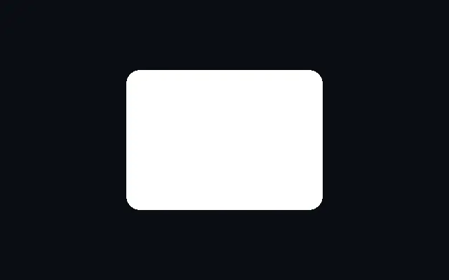

둥근 사각형

Rounded Rect

가로·세로 크기와 모서리 둥글기를 조절하는 사각형입니다.

다른 이름: RoundedRectRounded rectangleRounded box

WebGPU 를 지원하는 브라우저에서 움직입니다

이 기기에서는 데모를 그리지 못해 정지 화면을 보여 줍니다

React
// WebGPU 를 지원하는 브라우저에서만 그립니다.
import { Shader, RoundedRect } from 'shaders/react'

export default function ShaderEffect() {
  return (
    <Shader style={{ width: '100%', height: 320 }} disableTelemetry>
      <RoundedRect />
    </Shader>
  )
}
Vue
<!-- WebGPU 를 지원하는 브라우저에서만 그립니다. -->
<script setup lang="ts">
import { Shader, RoundedRect } from 'shaders/vue'
</script>

<template>
  <Shader style="width: 100%; height: 320px" :disable-telemetry="true">
    <RoundedRect/>
  </Shader>
</template>
Svelte
<!-- WebGPU 를 지원하는 브라우저에서만 그립니다. -->
<script>
  import { Shader, RoundedRect } from 'shaders/svelte'
</script>

<Shader style="width: 100%; height: 320px" disableTelemetry>
  <RoundedRect />
</Shader>
Solid
// WebGPU 를 지원하는 브라우저에서만 그립니다.
import { Shader, RoundedRect } from 'shaders/solid'

export default function ShaderEffect() {
  return (
    <Shader style={{ width: '100%', height: '320px' }} disableTelemetry>
      <RoundedRect />
    </Shader>
  )
}
JavaScript
// WebGPU 를 지원하는 브라우저에서만 그립니다.
// <canvas id="canvas" style="width:100%;height:320px"></canvas> 가 페이지에 있어야 한다
import { createShader } from 'shaders/js'

const shader = await createShader(document.getElementById("canvas"), {
  components: [
    {
      type: 'RoundedRect',
    }
  ]
}, { disableTelemetry: true })

속성(props) · RoundedRect

값을 바꾸면 위 데모와 코드 탭에 바로 반영됩니다. 설명은 라이브러리 레지스트리의 영어 원문(MIT)입니다.

이름값기본값범위·선택지설명(원문)
originOrigin코드에서 지정center—Reference edge the center position is measured from (center default). Lets you pin the shape relative to a corner or the canvas centre.
colorColor#ffffff—Fill color of the rectangle
centerCenter
x0.5y0.5
{"x":0.5,"y":0.5}x, y: 0 – 1Center position of the rectangle
widthWidth0.350.01 – 1 (step 0.01)Half-width of the rectangle
heightHeight0.250.01 – 1 (step 0.01)Half-height of the rectangle
roundingRounding0.050 – 0.5 (step 0.01)Corner rounding radius — set to min(width, height) for a pill shape
rotationRotation00 – 360 (step 1)Rotation in degrees
softnessSoftness00 – 0.1 (step 0.001)Edge softness for antialiasing
strokeThicknessStroke Thickness00 – 0.2 (step 0.005)Stroke thickness. Zero means no stroke.
strokeColorStroke Color#000000—Color of the stroke outline
strokePositionStroke Positioncenteroutside · center · insidePosition of the stroke relative to the shape edge
colorSpaceColor Blendinglinearlinear · oklch · oklab · hsl · hsv · lchColor space for blending fill and stroke colors

모든 컴포넌트 공통: blendMode · opacity · visible · maskSource/maskType · boundingBox · id

둥근 사각형은 카드나 입력창처럼 모서리만 부드럽게 처리된 판을 그립니다. 둥글기 값을 키우면 딱딱한 상자에서 캡슐형 버튼까지 이어집니다.

`width`와 `height`는 전체가 아닌 반쪽 크기이며 각각 0.01–1 범위입니다. `rounding`은 0–0.5 범위의 모서리 반지름으로, `width`와 `height` 중 작은 값까지 키우면 알약형이 됩니다. `rotation`은 0–360도 사이에서 모양을 돌립니다.

`width`와 `height`가 반쪽 크기라는 점을 놓치면 예상보다 큰 상자가 될 수 있습니다. 카드 바탕으로 먼저 두고, 작은 `strokeThickness`나 `Line`을 더해 테두리와 구분선을 구성하세요.

언제 쓰나

카드·입력창·캡슐형 버튼의 배경에 좋습니다. 기울어진 면이나 서로 다른 위아래 폭이 필요하면 피하고 Parallelogram 또는 Trapezoid를 고르세요.

페이지로 열기 ↗