Custom shader

커스텀 셰이더

Define a new pixel effect with `defineShader` when the built-in components cannot express it.

Also known as: Custom componentShader authoring

Moves in browsers that support WebGPU

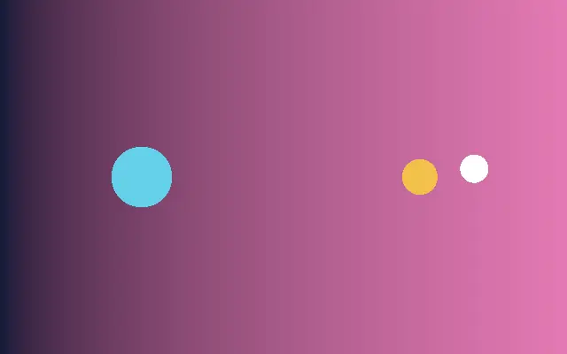
This device could not render the demo — showing a still

React
// Renders only in browsers with WebGPU.
import { Shader, Circle, Ring } from 'shaders/react'

export default function ShaderEffect() {
  return (
    <Shader style={{ width: '100%', height: 320 }} disableTelemetry>
      <Circle
        color="#fbbf24"
        radius={0.19}
        softness={0.2} />
      <Ring
        color="#22d3ee"
        radius={0.34}
        softness={0.06}
        thickness={0.035} />
      <Ring
        color="#a855f7"
        radius={0.44}
        softness={0.12}
        thickness={0.012} />
    </Shader>
  )
}
Vue
<!-- Renders only in browsers with WebGPU. -->
<script setup lang="ts">
import { Shader, Circle, Ring } from 'shaders/vue'
</script>

<template>
  <Shader style="width: 100%; height: 320px" :disable-telemetry="true">
    <Circle
      color="#fbbf24"
      :radius="0.19"
      :softness="0.2"/>
    <Ring
      color="#22d3ee"
      :radius="0.34"
      :softness="0.06"
      :thickness="0.035"/>
    <Ring
      color="#a855f7"
      :radius="0.44"
      :softness="0.12"
      :thickness="0.012"/>
  </Shader>
</template>
Svelte
<!-- Renders only in browsers with WebGPU. -->
<script>
  import { Shader, Circle, Ring } from 'shaders/svelte'
</script>

<Shader style="width: 100%; height: 320px" disableTelemetry>
  <Circle
    color="#fbbf24"
    radius={0.19}
    softness={0.2} />
  <Ring
    color="#22d3ee"
    radius={0.34}
    softness={0.06}
    thickness={0.035} />
  <Ring
    color="#a855f7"
    radius={0.44}
    softness={0.12}
    thickness={0.012} />
</Shader>
Solid
// Renders only in browsers with WebGPU.
import { Shader, Circle, Ring } from 'shaders/solid'

export default function ShaderEffect() {
  return (
    <Shader style={{ width: '100%', height: '320px' }} disableTelemetry>
      <Circle
        color="#fbbf24"
        radius={0.19}
        softness={0.2} />
      <Ring
        color="#22d3ee"
        radius={0.34}
        softness={0.06}
        thickness={0.035} />
      <Ring
        color="#a855f7"
        radius={0.44}
        softness={0.12}
        thickness={0.012} />
    </Shader>
  )
}
JavaScript
// Renders only in browsers with WebGPU.
// expects <canvas id="canvas" style="width:100%;height:320px"></canvas> on the page
import { createShader } from 'shaders/js'

const shader = await createShader(document.getElementById("canvas"), {
  components: [
    {
      type: 'Circle',
      props: {
        color: '#fbbf24',
        radius: 0.19,
        softness: 0.2,
      },
    },
    {
      type: 'Ring',
      props: {
        color: '#22d3ee',
        radius: 0.34,
        softness: 0.06,
        thickness: 0.035,
      },
    },
    {
      type: 'Ring',
      props: {
        color: '#a855f7',
        radius: 0.44,
        softness: 0.12,
        thickness: 0.012,
      },
    }
  ]
}, { disableTelemetry: true })

Props · Circle

Changes apply to the demo above and to the code tabs. Descriptions come from the library registry (MIT).

NameValueDefaultRange / optionsDescription
originOriginSet in codecenter—Reference edge the center position is measured from (center default). Lets you pin the shape relative to a corner or the canvas centre.
colorColor#ffffff—The color of the circle
radiusRadius10 – 2 (step 0.01)The radius of the circle. A value of one (1) is sets the circle to fit the canvas.
softnessSoftness00 – 1 (step 0.01)Edge softness. Lower values like zero (0) are sharp, higher values like one (1) are softer.
centerCenter Position
x0.5y0.5
{"x":0.5,"y":0.5}x, y: 0 – 1The center point of the circle
strokeThicknessStroke Thickness00 – 0.5 (step 0.01)The thickness of the stroke outline. Zero (0) means no stroke.
strokeColorStroke Color#000000—The color of the stroke outline
strokePositionStroke Positioncenteroutside · center · insidePosition of the stroke relative to the circle edge
colorSpaceColor Blendinglinearlinear · oklch · oklab · hsl · hsv · lchColor space for blending fill and stroke colors in soft edges

Every component also takes blendMode · opacity · visible · maskSource/maskType · boundingBox · id

A custom shader draws a shape or response that is difficult to express with the library's built-in components. It is like adding a personal way to mix paint for a halo that ready-made shapes cannot quite produce.

The upstream README's `Halo` example passes a `name`, `props` with defaults and transforms, and pixel-drawing `paint` to `defineShader`. Its `wgsl` body calculates pixel distance from a center and radius, then `<CustomShader src={Halo}>` mounts the definition in a scene.

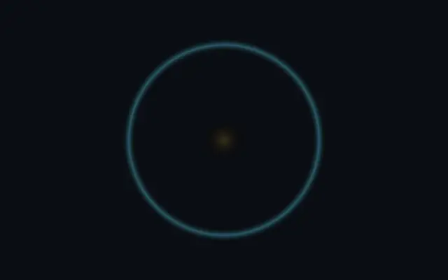
This demo combines the bundled `Circle` and `Ring` components to show a halo-like result. Custom code requires understanding and maintaining WGSL and shader inputs, so first check whether a combination of existing components already gives the needed look.

When to use

Use it for a branded effect with unique pixel math, a pattern that built-ins cannot express, or a shader component you will reuse. Avoid custom code when adjusting existing components is enough or nobody can maintain the GPU code.

Open as page ↗