React Vue Svelte Solid JavaScript Code reflects the control values
// Renders only in browsers with WebGPU.
// /samples/… are this site’s sample files — point them at your own image or video.
import { Shader, CornerPin, ImageTexture } from 'shaders/react'

export default function ShaderEffect() {
  return (
    <Shader style={{ width: '100%', height: 320 }} disableTelemetry>
      <ImageTexture
        objectFit="cover"
        url="/samples/poster.jpg" />
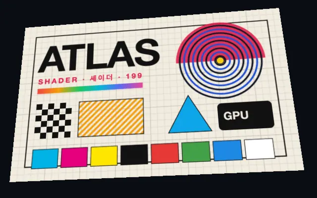
      <CornerPin
        bottomLeft={{
          x: 0.03,
          y: 0.92
        }}
        bottomRight={{
          x: 0.96,
          y: 0.86
        }}
        topLeft={{
          x: 0.08,
          y: 0.14
        }}
        topRight={{
          x: 0.88,
          y: 0.04
        }} />
    </Shader>
  )
}<!-- Renders only in browsers with WebGPU. -->
<!-- /samples/… are this site’s sample files — point them at your own image or video. -->
<script setup lang="ts">
import { Shader, CornerPin, ImageTexture } from 'shaders/vue'
</script>
<template>
<Shader style="width: 100%; height: 320px" :disable-telemetry="true">
<ImageTexture
object-fit="cover"
url="/samples/poster.jpg"/>
<CornerPin
:bottom-left="{
x: 0.03,
y: 0.92
}"
:bottom-right="{
x: 0.96,
y: 0.86
}"
:top-left="{
x: 0.08,
y: 0.14
}"
:top-right="{
x: 0.88,
y: 0.04
}"/>
</Shader>
</template><!-- Renders only in browsers with WebGPU. -->
<!-- /samples/… are this site’s sample files — point them at your own image or video. -->
<script>
import { Shader, CornerPin, ImageTexture } from 'shaders/svelte'
</script>
<Shader style="width: 100%; height: 320px" disableTelemetry>
<ImageTexture
objectFit="cover"
url="/samples/poster.jpg" />
<CornerPin
bottomLeft={{
x: 0.03,
y: 0.92
}}
bottomRight={{
x: 0.96,
y: 0.86
}}
topLeft={{
x: 0.08,
y: 0.14
}}
topRight={{
x: 0.88,
y: 0.04
}} />
</Shader>// Renders only in browsers with WebGPU.
// /samples/… are this site’s sample files — point them at your own image or video.
import { Shader, CornerPin, ImageTexture } from 'shaders/solid'
export default function ShaderEffect() {
return (
<Shader style={{ width: '100%', height: '320px' }} disableTelemetry>
<ImageTexture
objectFit="cover"
url="/samples/poster.jpg" />
<CornerPin
bottomLeft={{
x: 0.03,
y: 0.92
}}
bottomRight={{
x: 0.96,
y: 0.86
}}
topLeft={{
x: 0.08,
y: 0.14
}}
topRight={{
x: 0.88,
y: 0.04
}} />
</Shader>
)
}// Renders only in browsers with WebGPU.
// /samples/… are this site’s sample files — point them at your own image or video.
// expects <canvas id="canvas" style="width:100%;height:320px"></canvas> on the page
import { createShader } from 'shaders/js'
const shader = await createShader(document.getElementById("canvas"), {
components: [
{
type: 'ImageTexture',
props: {
objectFit: 'cover',
url: '/samples/poster.jpg',
},
},
{
type: 'CornerPin',
props: {
bottomLeft: {
x: 0.03,
y: 0.92
},
bottomRight: {
x: 0.96,
y: 0.86
},
topLeft: {
x: 0.08,
y: 0.14
},
topRight: {
x: 0.88,
y: 0.04
},
},
}
]
}, { disableTelemetry: true })