Barn Doors

양방향 와이프

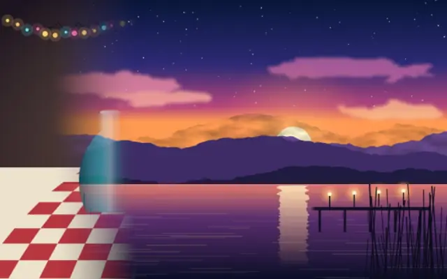
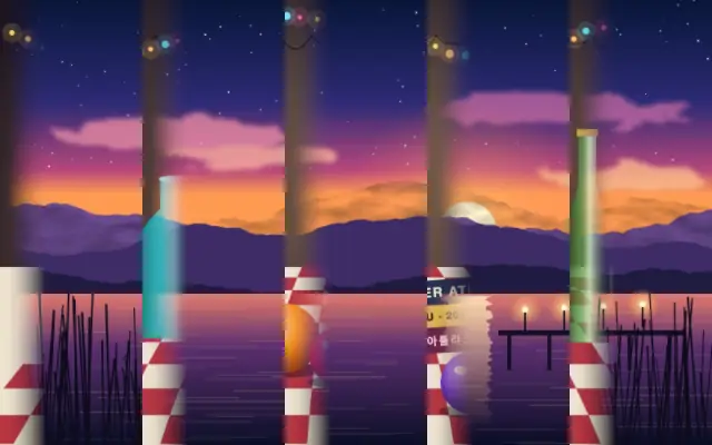
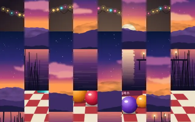
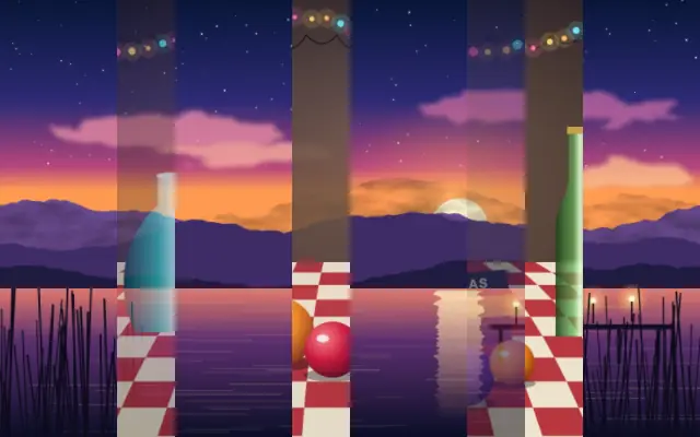
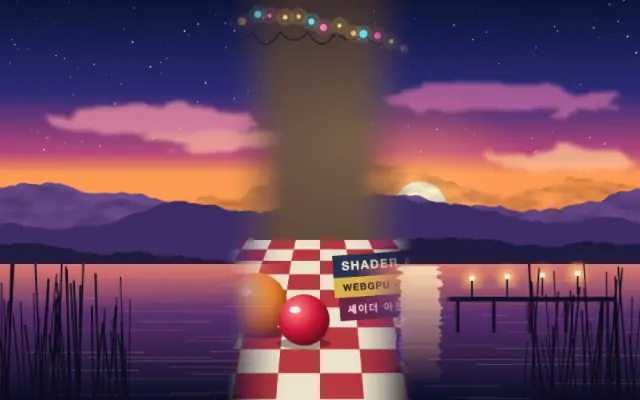
Two halves split at the center and move outward like opening doors.

Also known as: BarnDoorsbarn door transition

Moves in browsers that support WebGPU

This device could not render the demo — showing a still

React
// Renders only in browsers with WebGPU.
// /samples/… are this site’s sample files — point them at your own image or video.
import { Shader, BarnDoors, ImageTexture } from 'shaders/react'

export default function ShaderEffect() {
  return (
    <Shader style={{ width: '100%', height: 320 }} disableTelemetry>
      <ImageTexture
        objectFit="cover"
        url="/samples/still.jpg" />
      <BarnDoors
        progress={{
          type: "auto-animate",
          mode: "ping-pong",
          outputMin: 0,
          outputMax: 1,
          speed: 0.5
        }}>
        <ImageTexture
          objectFit="cover"
          url="/samples/photo.jpg" />
      </BarnDoors>
    </Shader>
  )
}
Vue
<!-- Renders only in browsers with WebGPU. -->
<!-- /samples/… are this site’s sample files — point them at your own image or video. -->
<script setup lang="ts">
import { Shader, BarnDoors, ImageTexture } from 'shaders/vue'
</script>

<template>
  <Shader style="width: 100%; height: 320px" :disable-telemetry="true">
    <ImageTexture
      object-fit="cover"
      url="/samples/still.jpg"/>
    <BarnDoors
      :progress="{
        type: 'auto-animate',
        mode: 'ping-pong',
        outputMin: 0,
        outputMax: 1,
        speed: 0.5
      }">
      <ImageTexture
        object-fit="cover"
        url="/samples/photo.jpg"/>
    </BarnDoors>
  </Shader>
</template>
Svelte
<!-- Renders only in browsers with WebGPU. -->
<!-- /samples/… are this site’s sample files — point them at your own image or video. -->
<script>
  import { Shader, BarnDoors, ImageTexture } from 'shaders/svelte'
</script>

<Shader style="width: 100%; height: 320px" disableTelemetry>
  <ImageTexture
    objectFit="cover"
    url="/samples/still.jpg" />
  <BarnDoors
    progress={{
      type: "auto-animate",
      mode: "ping-pong",
      outputMin: 0,
      outputMax: 1,
      speed: 0.5
    }}>
    <ImageTexture
      objectFit="cover"
      url="/samples/photo.jpg" />
  </BarnDoors>
</Shader>
Solid
// Renders only in browsers with WebGPU.
// /samples/… are this site’s sample files — point them at your own image or video.
import { Shader, BarnDoors, ImageTexture } from 'shaders/solid'

export default function ShaderEffect() {
  return (
    <Shader style={{ width: '100%', height: '320px' }} disableTelemetry>
      <ImageTexture
        objectFit="cover"
        url="/samples/still.jpg" />
      <BarnDoors
        progress={{
          type: "auto-animate",
          mode: "ping-pong",
          outputMin: 0,
          outputMax: 1,
          speed: 0.5
        }}>
        <ImageTexture
          objectFit="cover"
          url="/samples/photo.jpg" />
      </BarnDoors>
    </Shader>
  )
}
JavaScript
// Renders only in browsers with WebGPU.
// /samples/… are this site’s sample files — point them at your own image or video.
// expects <canvas id="canvas" style="width:100%;height:320px"></canvas> on the page
import { createShader } from 'shaders/js'

const shader = await createShader(document.getElementById("canvas"), {
  components: [
    {
      type: 'ImageTexture',
      props: {
        objectFit: 'cover',
        url: '/samples/still.jpg',
      },
    },
    {
      type: 'BarnDoors',
      props: {
        progress: {
          type: 'auto-animate',
          mode: 'ping-pong',
          outputMin: 0,
          outputMax: 1,
          speed: 0.5
        },
      },
      children: [
        {
          type: 'ImageTexture',
          props: {
            objectFit: 'cover',
            url: '/samples/photo.jpg',
          },
        },
      ],
    }
  ]
}, { disableTelemetry: true })

Props · BarnDoors

Changes apply to the demo above and to the code tabs. Descriptions come from the library registry (MIT).

NameValueDefaultRange / optionsDescription
progressProgressAuto-animated in the demo — moving it pins the value0.50 – 1 (step 0.01)How far the doors have opened (0 = fully visible, 1 = fully wiped away)
angleAngle00 – 360 (step 1)Direction the doors open in degrees (0 = apart horizontally)
featherFeather0.10 – 1 (step 0.01)Softness of the wipe edges
invertInvertfalse—Close in from both edges instead of opening from the center

Every component also takes blendMode · opacity · visible · maskSource/maskType · boundingBox · id

Two panels open from the center like stage doors, spreading attention outward from the seam.

`progress` defaults to 0.5 and ranges from 0 to 1 for the opening amount. `angle` defaults to 0 degrees and ranges from 0 to 360 degrees to change the opening direction. `feather` defaults to 0.1 and ranges from 0 to 1 for edge softness; `invert` defaults to false and closes inward from both edges.

Place it over the outgoing scene and put the incoming scene on a lower layer while animating progress. If a face or logo sits at the center, the seam can split it, so check the center and timing.

When to use

Use it to split two scenes from the center, create a stage-curtain intro, or transition outward to both sides. Avoid it when a centered face or logo must stay intact.

Open as page ↗