Dot Grid

도트 그리드

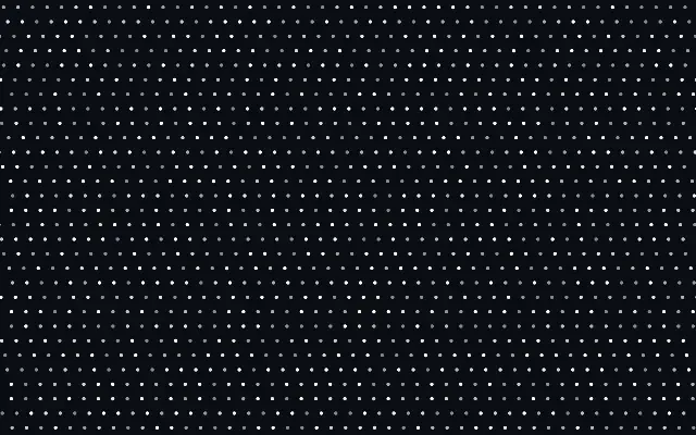
A regular field of dots that can twinkle or drift sideways.

Also known as: DotGrid점 격자

Moves in browsers that support WebGPU

This device could not render the demo — showing a still

React
// Renders only in browsers with WebGPU.
import { Shader, DotGrid } from 'shaders/react'

export default function ShaderEffect() {
  return (
    <Shader style={{ width: '100%', height: 320 }} disableTelemetry>
      <DotGrid
        speed={0.5}
        twinkle={0.5} />
    </Shader>
  )
}
Vue
<!-- Renders only in browsers with WebGPU. -->
<script setup lang="ts">
import { Shader, DotGrid } from 'shaders/vue'
</script>

<template>
  <Shader style="width: 100%; height: 320px" :disable-telemetry="true">
    <DotGrid
      :speed="0.5"
      :twinkle="0.5"/>
  </Shader>
</template>
Svelte
<!-- Renders only in browsers with WebGPU. -->
<script>
  import { Shader, DotGrid } from 'shaders/svelte'
</script>

<Shader style="width: 100%; height: 320px" disableTelemetry>
  <DotGrid
    speed={0.5}
    twinkle={0.5} />
</Shader>
Solid
// Renders only in browsers with WebGPU.
import { Shader, DotGrid } from 'shaders/solid'

export default function ShaderEffect() {
  return (
    <Shader style={{ width: '100%', height: '320px' }} disableTelemetry>
      <DotGrid
        speed={0.5}
        twinkle={0.5} />
    </Shader>
  )
}
JavaScript
// Renders only in browsers with WebGPU.
// expects <canvas id="canvas" style="width:100%;height:320px"></canvas> on the page
import { createShader } from 'shaders/js'

const shader = await createShader(document.getElementById("canvas"), {
  components: [
    {
      type: 'DotGrid',
      props: {
        speed: 0.5,
        twinkle: 0.5,
      },
    }
  ]
}, { disableTelemetry: true })

Props · DotGrid

Changes apply to the demo above and to the code tabs. Descriptions come from the library registry (MIT).

NameValueDefaultRange / optionsDescription
colorColor#ffffff—The color of the dot
densityDensity301 – 200 (step 1)The number of dots along the canvas height (the width fits as many as the aspect ratio allows)
dotSizeDot Size0.30 – 1 (step 0.01)The size of each dot, zero (0) being invisible, one (1) filled the grid with no gaps
offsetRow Offset00 – 1 (step 0.01)Horizontal stagger of alternating rows (0.5 = classic polka-dot brick offset)
speedSpeed0-3 – 3 (step 0.01)Animates the rows drifting horizontally (0 = static)
speedVarianceSpeed Variance0.30 – 1 (step 0.01)Per-row random speed variance for irregular drifting motion
twinkleTwinkle00 – 1 (step 0.1)Intensity of the twinkle effect (0 = off, 1 = full twinkle)

Every component also takes blendMode · opacity · visible · maskSource/maskType · boundingBox · id

Like halftone printing or a page of dot-grid paper, small circles sit in a regular arrangement. Dots make the grid feel lighter than continuous lines.

Increase `density` for more closely spaced dots and `dotSize` for larger ones. Set `offset` to 0.5 to stagger alternate rows like a classic polka-dot layout. `speed` controls horizontal row drift, and `twinkle` controls how strongly the dots shimmer.

`twinkle` defaults to 0, so the pattern starts without shimmer. The dots fill the canvas without an input layer. Very dense or large dots can make a busy background, so lower their contrast behind body text.

When to use

Use it for a light data-inspired background, halftone-like decoration, or a dot-based loading screen. Avoid it when shimmering or drifting dots would distract from reading.

Open as page ↗