Iris Wipe

아이리스 와이프

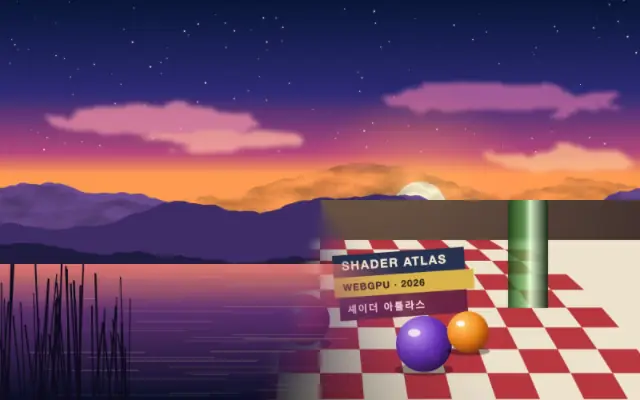
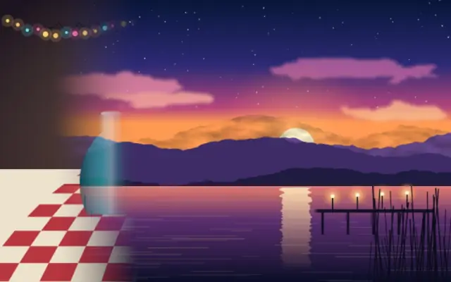
An expanding circular iris reveals or removes the input around a chosen center.

Also known as: IrisWipeiris transition

Moves in browsers that support WebGPU

This device could not render the demo — showing a still

React
// Renders only in browsers with WebGPU.
// /samples/… are this site’s sample files — point them at your own image or video.
import { Shader, ImageTexture, IrisWipe } from 'shaders/react'

export default function ShaderEffect() {
  return (
    <Shader style={{ width: '100%', height: 320 }} disableTelemetry>
      <ImageTexture
        objectFit="cover"
        url="/samples/still.jpg" />
      <IrisWipe
        progress={{
          type: "auto-animate",
          mode: "ping-pong",
          outputMin: 0,
          outputMax: 1,
          speed: 0.5
        }}>
        <ImageTexture
          objectFit="cover"
          url="/samples/photo.jpg" />
      </IrisWipe>
    </Shader>
  )
}
Vue
<!-- Renders only in browsers with WebGPU. -->
<!-- /samples/… are this site’s sample files — point them at your own image or video. -->
<script setup lang="ts">
import { Shader, ImageTexture, IrisWipe } from 'shaders/vue'
</script>

<template>
  <Shader style="width: 100%; height: 320px" :disable-telemetry="true">
    <ImageTexture
      object-fit="cover"
      url="/samples/still.jpg"/>
    <IrisWipe
      :progress="{
        type: 'auto-animate',
        mode: 'ping-pong',
        outputMin: 0,
        outputMax: 1,
        speed: 0.5
      }">
      <ImageTexture
        object-fit="cover"
        url="/samples/photo.jpg"/>
    </IrisWipe>
  </Shader>
</template>
Svelte
<!-- Renders only in browsers with WebGPU. -->
<!-- /samples/… are this site’s sample files — point them at your own image or video. -->
<script>
  import { Shader, ImageTexture, IrisWipe } from 'shaders/svelte'
</script>

<Shader style="width: 100%; height: 320px" disableTelemetry>
  <ImageTexture
    objectFit="cover"
    url="/samples/still.jpg" />
  <IrisWipe
    progress={{
      type: "auto-animate",
      mode: "ping-pong",
      outputMin: 0,
      outputMax: 1,
      speed: 0.5
    }}>
    <ImageTexture
      objectFit="cover"
      url="/samples/photo.jpg" />
  </IrisWipe>
</Shader>
Solid
// Renders only in browsers with WebGPU.
// /samples/… are this site’s sample files — point them at your own image or video.
import { Shader, ImageTexture, IrisWipe } from 'shaders/solid'

export default function ShaderEffect() {
  return (
    <Shader style={{ width: '100%', height: '320px' }} disableTelemetry>
      <ImageTexture
        objectFit="cover"
        url="/samples/still.jpg" />
      <IrisWipe
        progress={{
          type: "auto-animate",
          mode: "ping-pong",
          outputMin: 0,
          outputMax: 1,
          speed: 0.5
        }}>
        <ImageTexture
          objectFit="cover"
          url="/samples/photo.jpg" />
      </IrisWipe>
    </Shader>
  )
}
JavaScript
// Renders only in browsers with WebGPU.
// /samples/… are this site’s sample files — point them at your own image or video.
// expects <canvas id="canvas" style="width:100%;height:320px"></canvas> on the page
import { createShader } from 'shaders/js'

const shader = await createShader(document.getElementById("canvas"), {
  components: [
    {
      type: 'ImageTexture',
      props: {
        objectFit: 'cover',
        url: '/samples/still.jpg',
      },
    },
    {
      type: 'IrisWipe',
      props: {
        progress: {
          type: 'auto-animate',
          mode: 'ping-pong',
          outputMin: 0,
          outputMax: 1,
          speed: 0.5
        },
      },
      children: [
        {
          type: 'ImageTexture',
          props: {
            objectFit: 'cover',
            url: '/samples/photo.jpg',
          },
        },
      ],
    }
  ]
}, { disableTelemetry: true })

Props · IrisWipe

Changes apply to the demo above and to the code tabs. Descriptions come from the library registry (MIT).

NameValueDefaultRange / optionsDescription
progressProgressAuto-animated in the demo — moving it pins the value0.50 – 1 (step 0.01)How far the iris has expanded (0 = fully visible, 1 = fully wiped away)
centerCenter
x0.5y0.5
{"x":0.5,"y":0.5}x, y: 0 – 1Point the iris expands from
featherFeather0.10 – 1 (step 0.01)Softness of the iris edge
invertInvertfalse—Wipe from the outside inward instead

Every component also takes blendMode · opacity · visible · maskSource/maskType · boundingBox · id

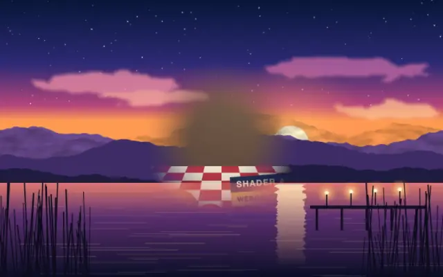
A circle grows like a camera iris opening to reveal a scene. Reversed, the round window closes and the frame disappears.

`progress` defaults to 0.5 and ranges from 0 to 1 for the transition amount. `center` defaults to {x: 0.5, y: 0.5} and sets where the circle grows from. `feather` defaults to 0.1 and ranges from 0 to 1 for edge softness; `invert` defaults to false and wipes from the outside inward.

Place an image or video beneath the effect. For a scene change, put the incoming scene on a lower layer and animate progress. Align the center and size so the edge does not cut through a face or important copy; a large feather can soften subject edges.

When to use

Use it for circular scene reveals, closing intros or outros, or transitions that focus attention at the center. Avoid it when the whole frame needs to move in a particular direction.

Open as page ↗