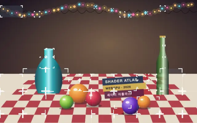
Partitions the content below into detection regions and draws bounding boxes with optional labels.
Also known as: ObjectTrackerdetection overlaybounding boxes
Moves in browsers that support WebGPU
This device could not render the demo — showing a still
Code reflects the control values
React
// Renders only in browsers with WebGPU.
// /samples/… are this site’s sample files — point them at your own image or video.
import { Shader, ImageTexture, ObjectTracker } from 'shaders/react'

export default function ShaderEffect() {
  return (
    <Shader style={{ width: '100%', height: 320 }} disableTelemetry>
      <ImageTexture
        objectFit="cover"
        url="/samples/still.jpg" />
      <ObjectTracker />
    </Shader>
  )
}
Vue
<!-- Renders only in browsers with WebGPU. -->
<!-- /samples/… are this site’s sample files — point them at your own image or video. -->
<script setup lang="ts">
import { Shader, ImageTexture, ObjectTracker } from 'shaders/vue'
</script>

<template>
  <Shader style="width: 100%; height: 320px" :disable-telemetry="true">
    <ImageTexture
      object-fit="cover"
      url="/samples/still.jpg"/>
    <ObjectTracker/>
  </Shader>
</template>
Svelte
<!-- Renders only in browsers with WebGPU. -->
<!-- /samples/… are this site’s sample files — point them at your own image or video. -->
<script>
  import { Shader, ImageTexture, ObjectTracker } from 'shaders/svelte'
</script>

<Shader style="width: 100%; height: 320px" disableTelemetry>
  <ImageTexture
    objectFit="cover"
    url="/samples/still.jpg" />
  <ObjectTracker />
</Shader>
Solid
// Renders only in browsers with WebGPU.
// /samples/… are this site’s sample files — point them at your own image or video.
import { Shader, ImageTexture, ObjectTracker } from 'shaders/solid'

export default function ShaderEffect() {
  return (
    <Shader style={{ width: '100%', height: '320px' }} disableTelemetry>
      <ImageTexture
        objectFit="cover"
        url="/samples/still.jpg" />
      <ObjectTracker />
    </Shader>
  )
}
JavaScript
// Renders only in browsers with WebGPU.
// /samples/… are this site’s sample files — point them at your own image or video.
// expects <canvas id="canvas" style="width:100%;height:320px"></canvas> on the page
import { createShader } from 'shaders/js'

const shader = await createShader(document.getElementById("canvas"), {
  components: [
    {
      type: 'ImageTexture',
      props: {
        objectFit: 'cover',
        url: '/samples/still.jpg',
      },
    },
    {
      type: 'ObjectTracker',
    }
  ]
}, { disableTelemetry: true })
Props · ObjectTracker
Changes apply to the demo above and to the code tabs. Descriptions come from the library registry (MIT).
Name
Value
Default
Range / options
Description
detectionModeDetect
bright
alpha · bright · dark · red · green · blue
What counts as a detectable object.
thresholdThreshold
0.25
0 – 1 (step 0.01)
Detection cut-off.
layoutLayout
mosaic
grid · quadtree · mosaic
How the canvas is partitioned into detection cells.
cellSizeBase Cell Size
400
24 – 800 (step 1)
Base cell size in pixels
maxDepthSubdivision
2
1 – 5 (step 1)
Maximum subdivision levels for Quadtree/Mosaic layouts (each level can quarter a cell).
boxStyleBox Style
corners
full · corners
Bounding box outline style
lineWidthLine Width
1.5
0.5 – 12 (step 0.5)
Thickness of the box outline in pixels.
cornerRadiusCorner Radius
0
0 – 40 (step 1)
Corner radius of the box outline in pixels
strokeColorStroke
#ffffff
—
Bounding box outline color.
fillColorFill
#5a79911a
—
Bounding box fill color.
labelColorLabel
#000000
—
Label text color.
labelBackgroundColorLabel Background
#ffffff
—
Label pill background color.
labelModeLabel
none
none · dimensions · percentage
What each label shows.
labelPositionLabel Position
bottom-right
bottom-left · bottom-right · top-left · top-right
Which corner of the box the label anchors to.
labelRadiusBorder Radius
0
0 – 30 (step 1)
Corner radius of the label pill in pixels.
labelInsetLabel Inset
true
—
Place the label inside or outside the box.
fontFamilyFont
Set in code
Inter
—
Google Fonts family used for label text.
fontWeightWeight
Set in code
500
—
Font weight for label text.
fontSizeSize
0.015
0.01 – 0.5 (step 0.005)
Label text size as a fraction of canvas height.
letterSpacingLetter Spacing
0
-0.1 – 0.5 (step 0.005)
Letter spacing for label text, in em units.
Every component also takes blendMode · opacity · visible · maskSource/maskType · boundingBox · id
Bounding boxes divide the image into detected regions, like an analysis-tool overlay. They appear over grid cells or subdivisions to expose the scene structure; labels can be enabled separately.
The default `detectionMode` is `bright`; it selects brightness, darkness, transparency, or an RGB channel as the detection criterion. `threshold` defaults to 0.25 and ranges from 0 to 1. The default `layout` is `mosaic`, with `grid`, `quadtree`, and `mosaic` options for partitioning the canvas. `cellSize` defaults to 400 and ranges from 24 to 800, while `maxDepth` defaults to 2 and ranges from 1 to 5 to set cell size and subdivision depth.
Place an image or video input underneath so boxes have content to inspect. Pair it with `KeyFrames` to show tracker paths alongside regions. Use it as a visual explanation rather than assuming semantic analysis, and avoid excessive subdivisions that crowd the frame with boxes and enabled labels.
When to use
Use it for analytics-dashboard mockups, computer-vision explanations, and demos that show image segmentation. Avoid it as a replacement for a product feature that needs actual person or object recognition.