Light Edge

움직이는 빛 테두리

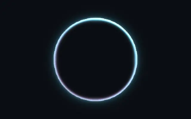
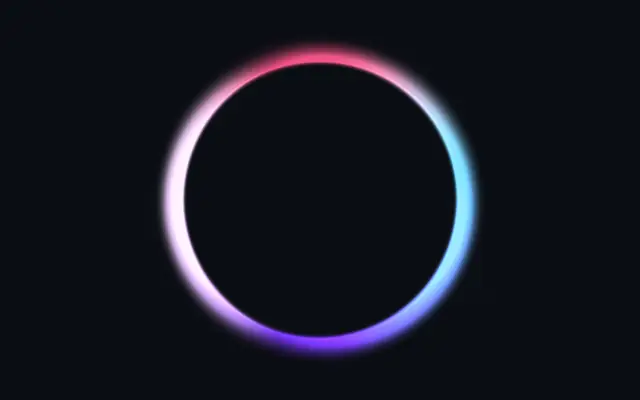
Colored light pulses and races around the edge of a shape.

Also known as: LightEdgeAnimated light edgeEdge glow

Moves in browsers that support WebGPU

This device could not render the demo — showing a still

React
// Renders only in browsers with WebGPU.
import { Shader, LightEdge } from 'shaders/react'

export default function ShaderEffect() {
  return (
    <Shader style={{ width: '100%', height: 320 }} disableTelemetry>
      <LightEdge />
    </Shader>
  )
}
Vue
<!-- Renders only in browsers with WebGPU. -->
<script setup lang="ts">
import { Shader, LightEdge } from 'shaders/vue'
</script>

<template>
  <Shader style="width: 100%; height: 320px" :disable-telemetry="true">
    <LightEdge/>
  </Shader>
</template>
Svelte
<!-- Renders only in browsers with WebGPU. -->
<script>
  import { Shader, LightEdge } from 'shaders/svelte'
</script>

<Shader style="width: 100%; height: 320px" disableTelemetry>
  <LightEdge />
</Shader>
Solid
// Renders only in browsers with WebGPU.
import { Shader, LightEdge } from 'shaders/solid'

export default function ShaderEffect() {
  return (
    <Shader style={{ width: '100%', height: '320px' }} disableTelemetry>
      <LightEdge />
    </Shader>
  )
}
JavaScript
// Renders only in browsers with WebGPU.
// expects <canvas id="canvas" style="width:100%;height:320px"></canvas> on the page
import { createShader } from 'shaders/js'

const shader = await createShader(document.getElementById("canvas"), {
  components: [
    {
      type: 'LightEdge',
    }
  ]
}, { disableTelemetry: true })

Props · LightEdge

Changes apply to the demo above and to the code tabs. Descriptions come from the library registry (MIT).

NameValueDefaultRange / optionsDescription
originOriginSet in codecenter—Reference edge the center position is measured from (center default). Lets you pin the shape relative to a corner or the canvas centre.
centerCenter
x0.5y0.5
{"x":0.5,"y":0.5}x, y: 0 – 1Center position of the shape
scaleScale10.1 – 3 (step 0.01)Scale of the shape (1 = default size)
rotationRotation00 – 360 (step 1)Rotation of the shape in degrees
colorAColor A#7b2ff7—First border light color (used when no gradient stops are set)
colorBColor B#00e0ff—Second border light color (used when no gradient stops are set)
stopsColorsSet in code[{"color":"#7b2ff7","position":0},{"color":"#00e0ff","pos…—Multi-stop gradient colors (overrides Color A / Color B when set)
colorSpaceColor Spacelinearlinear · oklch · oklab · hsl · hsv · lchColor space overlapping lights blend in
thicknessThickness0.250.01 – 1 (step 0.01)Width of the border band
softnessSoftness0.50 – 1 (step 0.01)Edge softness — 0 = crisp band, 1 = wide smooth gradient
intensityIntensity0.60 – 1 (step 0.01)Brightness of the individual light spots
bloomBloom0.30 – 1 (step 0.01)How additively overlapping lights pile up — high values overdrive to white
spotsSpots31 – 5 (step 1)Number of light spots orbiting per color
spotSizeSpot Size0.50 – 1 (step 0.01)Angular size of each light spot
pulsePulse00 – 1 (step 0.01)Heartbeat pulsing — synchronizes the lights to a double-beat rhythm
smokeSmoke0.30 – 1 (step 0.01)Noisy luminous smoke drifting along the border
smokeSizeSmoke Size0.50 – 1 (step 0.01)Scale of the smoke billows
speedSpeed10 – 4 (step 0.1)Animation speed. 0 pauses.
seedSeed00 – 100 (step 1)Random seed — re-rolls spot speeds, directions and phases
shapeShapeSet in code{"type":"sphere3D","radius":0.35}—Serialized shape configuration (JSON)
shapeSdfUrlshapeSdfUrlSet in code—URL to a pre-generated SDF .bin file
shapeTypeshapeTypeSet in code—Active SDF shape type

Every component also takes blendMode · opacity · visible · maskSource/maskType · boundingBox · id

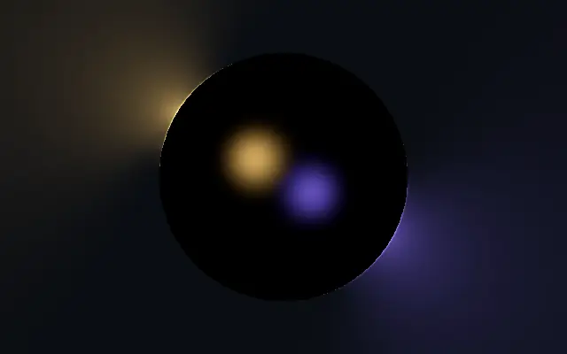
It resembles light travelling around a dark sign: a colored band and bright spots move along the outline.

Raise `thickness` for a wider edge band. `softness` changes it from a crisp line into a smooth gradient. `intensity` controls individual light spots, while `bloom` sets how much overlapping light washes toward white. Raise `pulse` for a repeating heartbeat in brightness.

The effect lights the edge of its own shape and works well against a plain backdrop. Moving borders around small text or every button can scatter attention, so reserve them for a few accents.

When to use

Use it for a loading accent, a highlight badge, or one or two CTA outlines on a dark screen. Avoid repeating it around every control or long blocks of text.

Open as page ↗