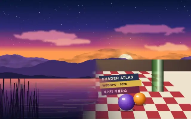
Page Peel

페이지 말림

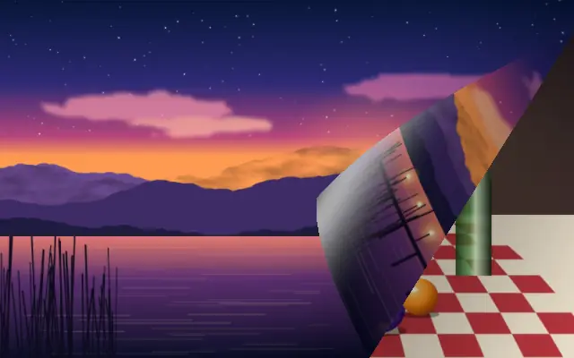
The input curls away from a corner like a sheet of paper being peeled back.

Also known as: PagePeelpage curl transitionpage-turn effect

Moves in browsers that support WebGPU

This device could not render the demo — showing a still

React
// Renders only in browsers with WebGPU.
// /samples/… are this site’s sample files — point them at your own image or video.
import { Shader, ImageTexture, PagePeel } from 'shaders/react'

export default function ShaderEffect() {
  return (
    <Shader style={{ width: '100%', height: 320 }} disableTelemetry>
      <ImageTexture
        objectFit="cover"
        url="/samples/still.jpg" />
      <PagePeel
        amount={{
          type: "auto-animate",
          mode: "ping-pong",
          outputMin: 0.05,
          outputMax: 0.85,
          speed: 0.5
        }}>
        <ImageTexture
          objectFit="cover"
          url="/samples/photo.jpg" />
      </PagePeel>
    </Shader>
  )
}
Vue
<!-- Renders only in browsers with WebGPU. -->
<!-- /samples/… are this site’s sample files — point them at your own image or video. -->
<script setup lang="ts">
import { Shader, ImageTexture, PagePeel } from 'shaders/vue'
</script>

<template>
  <Shader style="width: 100%; height: 320px" :disable-telemetry="true">
    <ImageTexture
      object-fit="cover"
      url="/samples/still.jpg"/>
    <PagePeel
      :amount="{
        type: 'auto-animate',
        mode: 'ping-pong',
        outputMin: 0.05,
        outputMax: 0.85,
        speed: 0.5
      }">
      <ImageTexture
        object-fit="cover"
        url="/samples/photo.jpg"/>
    </PagePeel>
  </Shader>
</template>
Svelte
<!-- Renders only in browsers with WebGPU. -->
<!-- /samples/… are this site’s sample files — point them at your own image or video. -->
<script>
  import { Shader, ImageTexture, PagePeel } from 'shaders/svelte'
</script>

<Shader style="width: 100%; height: 320px" disableTelemetry>
  <ImageTexture
    objectFit="cover"
    url="/samples/still.jpg" />
  <PagePeel
    amount={{
      type: "auto-animate",
      mode: "ping-pong",
      outputMin: 0.05,
      outputMax: 0.85,
      speed: 0.5
    }}>
    <ImageTexture
      objectFit="cover"
      url="/samples/photo.jpg" />
  </PagePeel>
</Shader>
Solid
// Renders only in browsers with WebGPU.
// /samples/… are this site’s sample files — point them at your own image or video.
import { Shader, ImageTexture, PagePeel } from 'shaders/solid'

export default function ShaderEffect() {
  return (
    <Shader style={{ width: '100%', height: '320px' }} disableTelemetry>
      <ImageTexture
        objectFit="cover"
        url="/samples/still.jpg" />
      <PagePeel
        amount={{
          type: "auto-animate",
          mode: "ping-pong",
          outputMin: 0.05,
          outputMax: 0.85,
          speed: 0.5
        }}>
        <ImageTexture
          objectFit="cover"
          url="/samples/photo.jpg" />
      </PagePeel>
    </Shader>
  )
}
JavaScript
// Renders only in browsers with WebGPU.
// /samples/… are this site’s sample files — point them at your own image or video.
// expects <canvas id="canvas" style="width:100%;height:320px"></canvas> on the page
import { createShader } from 'shaders/js'

const shader = await createShader(document.getElementById("canvas"), {
  components: [
    {
      type: 'ImageTexture',
      props: {
        objectFit: 'cover',
        url: '/samples/still.jpg',
      },
    },
    {
      type: 'PagePeel',
      props: {
        amount: {
          type: 'auto-animate',
          mode: 'ping-pong',
          outputMin: 0.05,
          outputMax: 0.85,
          speed: 0.5
        },
      },
      children: [
        {
          type: 'ImageTexture',
          props: {
            objectFit: 'cover',
            url: '/samples/photo.jpg',
          },
        },
      ],
    }
  ]
}, { disableTelemetry: true })

Props · PagePeel

Changes apply to the demo above and to the code tabs. Descriptions come from the library registry (MIT).

NameValueDefaultRange / optionsDescription
cornerCornerbottom-righttop-left · top-right · bottom-left · bottom-rightWhich corner the page peels from
amountAmountAuto-animated in the demo — moving it pins the value0.20 – 1 (step 0.01)How far the peel has progressed across the page (0 = flat, 1 = fully peeled)
radiusCurl Radius0.20.02 – 0.4 (step 0.01)Tightness of the curl (fraction of the page diagonal)
shadingShading0.550 – 1 (step 0.01)How much the underside of the curl is shaded for depth
highlightHighlight0.40 – 1 (step 0.01)Strength of the specular sheen running along the curl
highlightSoftnessHighlight Softness0.20 – 1 (step 0.01)Width of the specular highlight band (low = tight gloss, high = broad satin)
shadowShadow10 – 1 (step 0.01)Strength of the contact shadow the curl casts on the page

Every component also takes blendMode · opacity · visible · maskSource/maskType · boundingBox · id

It looks like a sheet of paper being lifted from one corner, exposing what lies beneath. The curved edge and shadow suggest a physical page turn.

`corner` defaults to bottom-right and selects the peeling corner. `amount` defaults to 0.2 and ranges from 0 to 1 for the peel progress; `radius` defaults to 0.2 and ranges from 0.02 to 0.4 for curl tightness. `shading` defaults to 0.55 and ranges from 0 to 1 for underside shading, while `highlight` defaults to 0.4 and ranges from 0 to 1 for the sheen along the curl.

Place an image or video beneath it; a lower incoming scene can show through the peel. A broad radius makes a gentler curl and a smaller value tightens it. Strong highlights and shadows can make flat graphics feel heavy.

When to use

Use it for a page or card reveal, a transition that uncovers a photo, or paper-like graphics. Avoid it for fast, minimal app transitions or simple text changes.

Open as page ↗