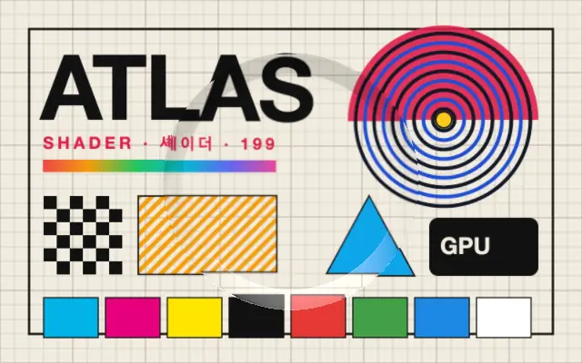
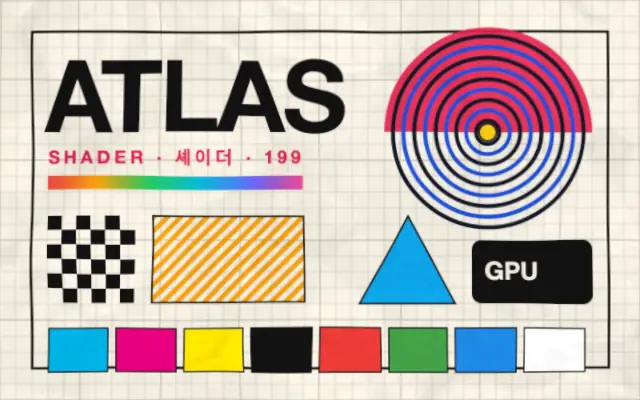
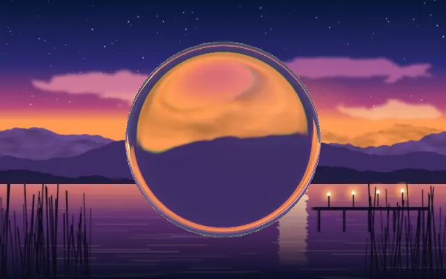
Relief shading that makes child content look embossed or debossed.
Also known as: EmbossEmboss / debossRelief
Moves in browsers that support WebGPU
This device could not render the demo — showing a still
Code reflects the control values
React
// Renders only in browsers with WebGPU.
// /samples/… are this site’s sample files — point them at your own image or video.
import { Shader, Emboss, ImageTexture } from 'shaders/react'

export default function ShaderEffect() {
  return (
    <Shader style={{ width: '100%', height: 320 }} disableTelemetry>
      <ImageTexture
        objectFit="cover"
        url="/samples/poster.jpg" />
      <Emboss />
    </Shader>
  )
}
Vue
<!-- Renders only in browsers with WebGPU. -->
<!-- /samples/… are this site’s sample files — point them at your own image or video. -->
<script setup lang="ts">
import { Shader, Emboss, ImageTexture } from 'shaders/vue'
</script>

<template>
  <Shader style="width: 100%; height: 320px" :disable-telemetry="true">
    <ImageTexture
      object-fit="cover"
      url="/samples/poster.jpg"/>
    <Emboss/>
  </Shader>
</template>
Svelte
<!-- Renders only in browsers with WebGPU. -->
<!-- /samples/… are this site’s sample files — point them at your own image or video. -->
<script>
  import { Shader, Emboss, ImageTexture } from 'shaders/svelte'
</script>

<Shader style="width: 100%; height: 320px" disableTelemetry>
  <ImageTexture
    objectFit="cover"
    url="/samples/poster.jpg" />
  <Emboss />
</Shader>
Solid
// Renders only in browsers with WebGPU.
// /samples/… are this site’s sample files — point them at your own image or video.
import { Shader, Emboss, ImageTexture } from 'shaders/solid'

export default function ShaderEffect() {
  return (
    <Shader style={{ width: '100%', height: '320px' }} disableTelemetry>
      <ImageTexture
        objectFit="cover"
        url="/samples/poster.jpg" />
      <Emboss />
    </Shader>
  )
}
JavaScript
// Renders only in browsers with WebGPU.
// /samples/… are this site’s sample files — point them at your own image or video.
// expects <canvas id="canvas" style="width:100%;height:320px"></canvas> on the page
import { createShader } from 'shaders/js'

const shader = await createShader(document.getElementById("canvas"), {
  components: [
    {
      type: 'ImageTexture',
      props: {
        objectFit: 'cover',
        url: '/samples/poster.jpg',
      },
    },
    {
      type: 'Emboss',
    }
  ]
}, { disableTelemetry: true })
Props · Emboss
Changes apply to the demo above and to the code tabs. Descriptions come from the library registry (MIT).
Name
Value
Default
Range / options
Description
originOrigin
Set in code
center
—
Reference edge the center position is measured from (center default). Lets you pin the shape relative to a corner or the canvas centre.
It resembles lettering pressed into or raised from paper: highlights and shadows along the edge create the sense of relief.
Positive `depth` raises the surface; negative `depth` presses it inward. `lightAngle` sets the direction of highlights and shadows, and `lightIntensity` controls their contrast. Raise `shadowIntensity` for darker inset areas.
Place an image or shape underneath for the light and shadow to act on. A plain surface with enough contrast makes the relief visible; low-contrast small lettering can disappear.
When to use
Use it for embossed logos, pressed paper labels, or dimensional button surfaces. Avoid it on small low-contrast text or controls that rely on shading alone to convey state.